
-34.928621
138.599959
Adelaide SA, Australia
Share this:
- Share on X (Opens in new window) X
- Share on Facebook (Opens in new window) Facebook
- Print (Opens in new window) Print
- Share on Tumblr (Opens in new window) Tumblr
- Email a link to a friend (Opens in new window) Email
- Share on Pinterest (Opens in new window) Pinterest
- Share on LinkedIn (Opens in new window) LinkedIn
- Share on Reddit (Opens in new window) Reddit

These are really elegantly done. And again- loving those particular tones. :0)
Thank you.
too clean, I hate moralizing, lively, nonconformity … !!! but good photos … !!!
🙂 🙂 🙂 thank you.
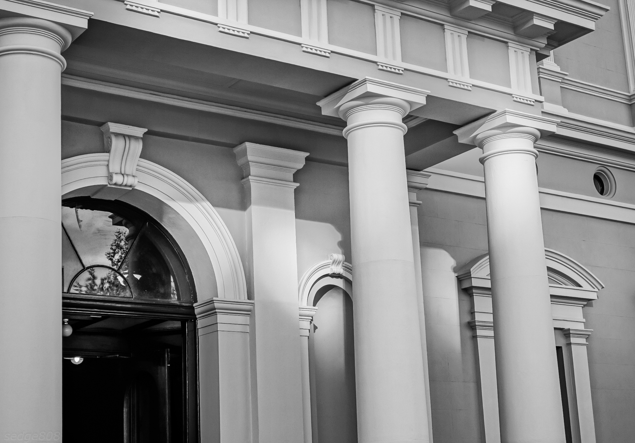
elegant is a good word for these!! – and the way the light slants into it!
thank you. they have just been repainted.
Wow these are fantastic! I hope you are well my friend! <3:)
thank you ❤
When you shoot do you shoot in black and white, or do you convert to b/w? I’m working on some art and I have photos I need to convert to B/W. I’m curious how you do this. I wonder if there is a better way to do it then I am? Your photos always seem crisp. Probably the photographer I think!
Mostly I shoot in color, then convert to b&w….but my Sony does a fab b&w (in camera), which I also use.
That is good to know! I was thinking there might be some secret I don’t know of! I have noticed in photoshop that before I convert to CMYK because I’m going to print, I can go under adjustment and to black/white and then still adjust the colors. I thought that was interesting. This has helped so the black/white is not so washed out looking! Then I convert it to gray scale and adjust again! It’s hard because the project does not call for color so I am so challeneged with my design but I’m up for the challenge. Plus I’m working with an amateur photographer and also cheering her on. It’s amazing the gifts and talents others have they don’t even realize till someone says hey I think you have an eye for photography! We’ll see what comes of it! Thank you for your sharing! I appreciate it very much! 🙂
You are very welcome….Gavin
The convert to b&w is something I learned, over time. Sometimes it doesn’t work very well with some photos…..
The two pieces are very effectively individually. What I find fascinating is how their close placement to each other on the blog page creates an Escher quality; it is as if the two spaces and their architectural content have run into one another creating a new dimensional space. 🙂
Yes. I noticed that too.
Rather surreal.