Share this:
- Share on X (Opens in new window) X
- Share on Facebook (Opens in new window) Facebook
- Print (Opens in new window) Print
- Share on Tumblr (Opens in new window) Tumblr
- Email a link to a friend (Opens in new window) Email
- Share on Pinterest (Opens in new window) Pinterest
- Share on LinkedIn (Opens in new window) LinkedIn
- Share on Reddit (Opens in new window) Reddit

stunning… …the clearness vs the pale. cool photo!
Thank you
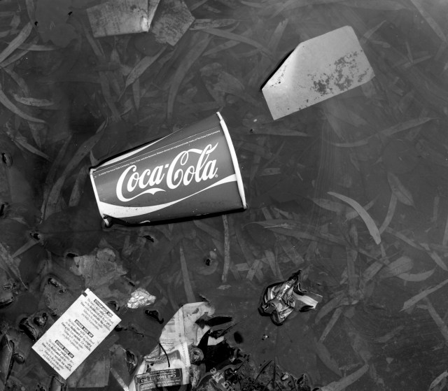
Lovely composition, there’s an extra depth with the lack of what we perceive to be an obvious brand colour! 🙂
Well said. Thank you.
a shame it looks like it’s in trash.
Reblogged this on From 1 Blogger 2 Another.
Thank you